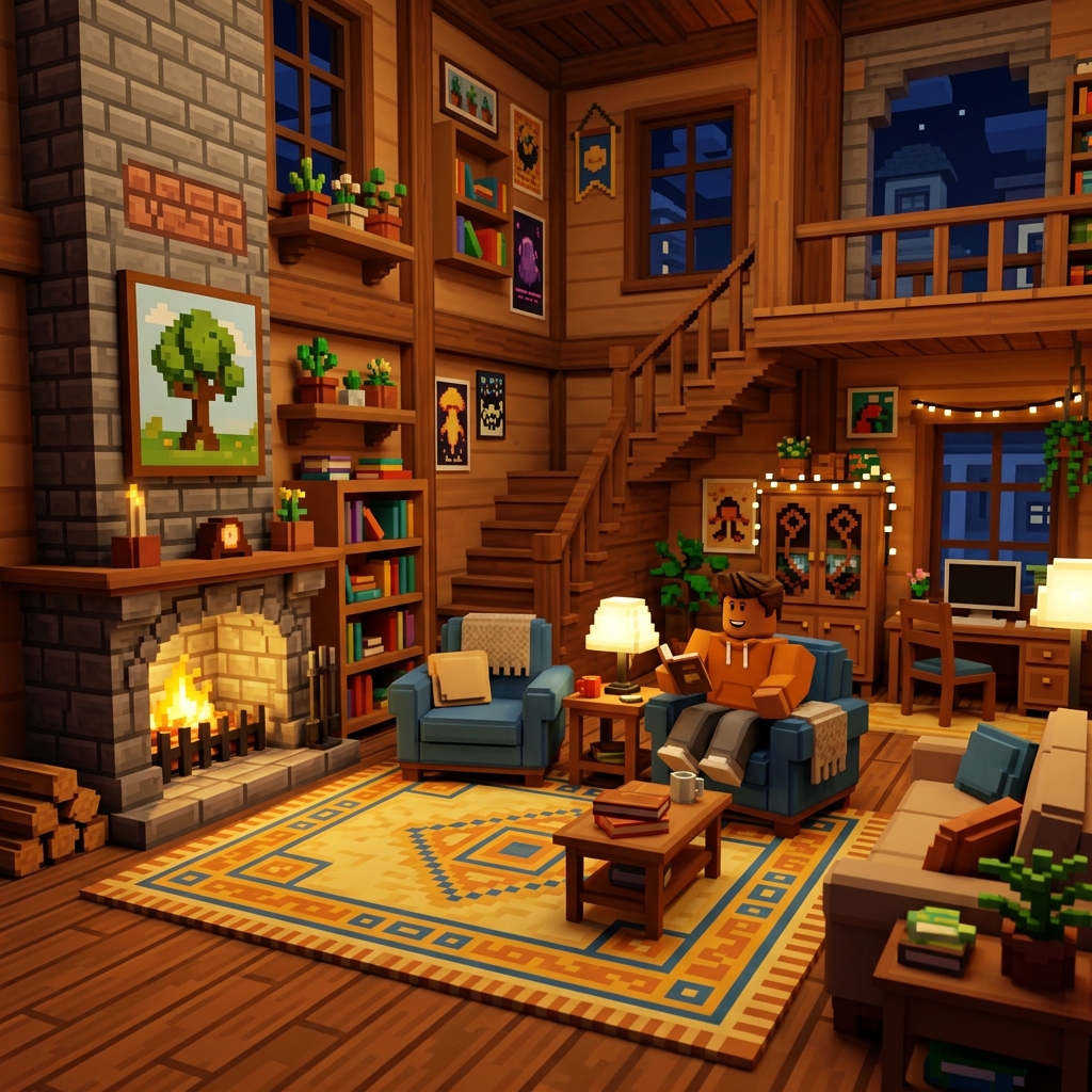
Advanced building in Roblox Studio is less about secret tricks and more about repeatable decision-making. Most creators hit a plateau because they focus on isolated details before the scene itself is strong. They decorate a weak layout, light a confusing room, or add props to spaces that do not have a clear purpose. The answer is not just “practice more.” The answer is to practice in a way that improves structure first, then polish.
This guide is written for creators who already understand basic movement, part placement, and the idea of working inside Studio, but who want environments that look more deliberate and feel better to play through. If you are still very new to Roblox itself, start with our beginner guide first so the wider platform context is clear.
Step 1: Define the purpose of the space before you build it
Every strong Roblox environment answers one early question: what is the player supposed to do here? A lobby teaches orientation. A shop supports transactions. A combat map creates routes, angles, and pressure. A roleplay room builds mood. A builder who skips this question usually ends up with attractive but confusing spaces. The build may look good in screenshots and still fail during actual play.
Before placing your first refined wall or prop, write one sentence describing the purpose of the area. Then list the player actions that should happen there. If the room is a hub, players need room to gather, spot exits, and identify next steps. If the map section is for combat, players need readable cover, route choices, and sightlines that create tension without chaos. That simple exercise will influence every choice after it: scale, clutter, lighting, navigation, and focal points.
Step 2: Block out with big shapes before touching detail
Blockouts save projects. They help you test layout, movement, and composition while changes are still cheap. Work with large simple shapes first. Ignore trim, ignore decals, ignore polished material choices. Walk through the space. Check whether doors feel too narrow, whether paths naturally lead players where you expect, and whether the main focal point is visible from the right angle.
The point of a blockout is to expose weak decisions early. If the room is already awkward in plain shapes, more detail will only hide the problem temporarily. Many improving builders resist this phase because it feels unfinished. That discomfort is normal. Stay with it. Good builders are not the ones who polish fastest. They are the ones who notice structural issues before polish begins.
Step 3: Get scale right using player movement, not guesswork
Scale is one of the biggest differences between a build that feels believable and one that feels slightly wrong. Newer creators often size rooms based on what looks dramatic from one camera angle, not based on how avatars move through them. That leads to oversized interiors, tiny props, stairs that feel off, or open spaces with no intimacy.
The fix is practical. Test scale from the player’s actual perspective. Walk, jump, strafe, pause at entrances, and look at whether the environment gives meaningful visual information. Ask whether corridors feel purposeful or empty, whether platforms give enough landing confidence, and whether important objects read instantly. If the answer is no, adjust size before you decorate.
Step 4: Build clear focal points and a visual hierarchy
Good environments guide attention. Players should know where to look when they enter a space. A spawn area might point them toward a central statue, portal, sign, or strong light source. A combat route might pull attention to the riskier high ground. A roleplay room might highlight a stage, service desk, or feature wall.
Visual hierarchy means deciding what matters most, second most, and least. Use scale, contrast, shape, and spacing to create that order. If every object is bright, detailed, and important, nothing is important. If one area is clearly dominant and the surrounding details support it, the space becomes easier to understand and more memorable.
Step 5: Use detail to support navigation, not bury it
Many improving builders start getting better and then overcorrect by adding detail everywhere. They want richness, but what they create is noise. Detail works best when it clarifies identity, scale, or direction. A cluttered shelf can tell a story. Repeated light fixtures can help rhythm. Floor variation can separate lanes. But random prop density rarely improves a space.
When adding detail, ask what each layer does. Is it mood? Is it structure? Is it navigation? Is it realism? If you cannot answer, delete it or move it later in the process. A common professional habit is to build clean first, then add small clusters of detail only where they support the scene’s purpose.
Step 6: Light for readability first, atmosphere second
Lighting can transform an average build, but it can also damage a strong layout if you chase mood before readability. Players need to understand surfaces, routes, and hazards. If shadows hide important information, or if bright accent lighting competes with the main path, the scene becomes frustrating regardless of how cinematic it looks.
Start with broad readability. Make sure major surfaces are visible and the player can identify exits, interactable zones, and important landmarks. Then layer in atmosphere with color contrast, softer pools of light, window glow, or targeted highlights. In horror or mystery spaces, darkness can be a tool, but it still needs structure. Confusion is not the same thing as tension.
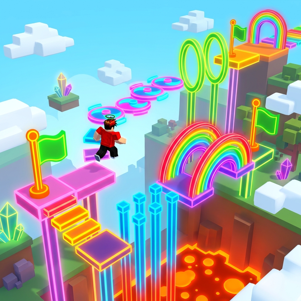
Step 7: Design routes, not just rooms
Players experience maps through motion. That means the route between spaces matters as much as the spaces themselves. Builders often create a great room, then connect it with a forgettable hallway or flat transition. Instead, think about how pace changes. Where should the player slow down? Where should they feel exposed? Where should curiosity pull them around a corner?
For obbies and challenge maps, route design is the whole game. The same is true in a quieter way for social hubs, story spaces, and combat zones. You are choreographing attention and movement. Vary height, width, and visibility to keep the route alive. A sequence of identical corridors kills momentum fast.
Step 8: Iterate in passes instead of trying to finish everything at once
Strong builders rarely complete one room perfectly in a single pass. They work in layers: layout, scale, major materials, focal points, navigation detail, secondary props, lighting, and polish. This keeps the whole map developing together and prevents one hyper-polished area from setting a standard the rest of the project cannot match.
Iterating in passes also protects your time. If a big structural change becomes necessary, you have not wasted hours on tiny decorative work. Try setting short sessions around one pass only. One day can be route fixes. Another can be color and material consistency. Another can be prop cleanup. This system makes progress more measurable and less emotionally exhausting.
Step 9: Optimize early enough that you do not fear performance later
Optimization is not glamorous, but it matters. Excessive clutter, poorly planned lighting, and wasteful duplication can turn a nice scene into a sluggish one. The best habit is not obsessive micro-optimization from the start. It is staying aware of performance while you build. Ask whether a repeated decorative object is actually helping, whether far-away detail needs to be that dense, and whether expensive effects are doing enough to justify themselves.
It is much easier to keep a project healthy than to rescue a bloated one late. That is especially true for large roleplay spaces, social hubs, and layered interiors. Clean structure and selective detail usually look better anyway.
Step 10: Test with real movement patterns and real players
Creators become blind to their own spaces. You know what you intended, so you naturally interpret the room generously. Testers do not have that advantage. Watch where people hesitate, where they miss an exit, where they jump into geometry, or where they ignore an important focal point. Those moments are gold. They tell you exactly where your build is less clear than you think.
Testing is not just bug hunting. It is design feedback. If everyone takes the same route when you wanted three meaningful options, your route balance may be weak. If nobody notices the dramatic feature wall you spent hours on, your composition may be competing with itself. Let player behavior challenge your assumptions.
Common mistakes advanced builders still make
One frequent mistake is trying to impress other builders instead of serving players. This creates rooms full of clever trim and material work but weak gameplay value. Another is relying on symmetry everywhere. Symmetry can be useful, but overuse drains personality and reduces spatial tension. Another is changing style too often within the same project. A map can be diverse, but it still needs a consistent design language.
There is also the trap of comparing unfinished work to polished showcase builds. That comparison usually produces bad decisions. It makes creators rush detail, ignore iteration, and skip testing. Build quality comes from sequence, not from inspiration alone.
A weekly practice routine that actually improves your building
If you want to improve faster, give yourself small focused exercises. On one day, rebuild a room from memory and concentrate only on scale. On another, create three different focal-point solutions for the same space. On another, take a plain corridor and make it readable using only lighting and shape, not clutter. On another, redesign an obby lane so the challenge pacing is clearer. These constrained drills improve your instincts more than endlessly polishing one favorite project.
Pair those exercises with analysis. Open games you admire and ask what the environment is doing for the player. Why does the lobby feel welcoming? Why is the route readable? Why does the room feel large without becoming empty? Observing good work with intentional questions is one of the cheapest and fastest ways to improve.
What to read next
If you are building because you want a better feel for the overall platform, return to our Roblox Beginner's Guide for broader player context. If you want to study which kinds of experiences keep players engaged, use our Top 25 Roblox Games to Play in 2026 as a genre map. If your project includes skill-based action spaces or ranked-style route design, our competitive guide will help you think more clearly about how players read pressure and movement.
For official creator documentation and platform tools, the Roblox Creator Hub is still the best reference source. Use it for technical specifics. Use guides like this one for workflow judgment and environment design thinking.